


The 60-30-10 Rule in Interior Design: The Secret to a Balanced and Beautiful Space
When you step into a beautifully designed room, chances are it feels effortlessly balanced, welcoming, and cohesive. But behind that polished look is often a simple formula that professional designers swear by — the 60-30-10 rule. Whether you’re decorating a living room, bedroom, or even an office, this timeless rule can help guide your color choices and bring harmony to your space.
What Is the 60-30-10 Rule?
The 60-30-10 rule is a classic interior design principle that breaks down your room’s color palette into three percentages:
- 60% – Dominant Color
- 30% – Secondary Color
- 10% – Accent Color
This formula ensures that your space feels balanced, visually appealing, and not overwhelming. Let’s break it down:
60%: The Dominant Color
This is the main color of your room and acts as the backdrop. It should cover about 60% of the space and typically includes:
- Walls
- Large area rugs
- Big furniture like sofas or bedspreads
The dominant color sets the tone and mood of the room. It’s often neutral or muted (like beige, gray, soft blues, or earthy tones) because it needs to be versatile and easy to live with.
📝 Tip: Think of the 60% as your “canvas.” Choose something you won’t tire of quickly — this color is going to surround you the most.
30%: The Secondary Color
The 30% color supports the dominant shade while adding contrast and depth. It is used in:
- Curtains
- Chairs
- Bed linens
- Painted furniture or a feature wall
This secondary hue should complement the dominant color while helping to keep things visually interesting. You can go bolder here or use a deeper or lighter shade of the main color family.
📝 Tip: This is your chance to play a little — go with patterns or textures in this color family to add personality without going overboard.
10%: The Accent Color
This is your pop of interest — the wow factor. The 10% color adds energy and dimension and is typically found in:
- Cushions
- Lamps
- Artwork
- Decorative accessories (vases, trays, throws)
Accent colors are where you can have fun with bold hues or seasonal changes. Think vibrant yellows, emerald greens, or striking black — just enough to catch the eye without dominating the room.
📝 Tip: Don’t overuse this color. That 10% is small but mighty. Too much, and it can throw off the balance.
Why the 60-30-10 Rule Works
✅ Creates balance: It prevents the space from feeling too flat or too chaotic.
✅ Guides decision-making: It simplifies the process of selecting colors and furnishings.
✅ Offers flexibility: You can apply it to any style — modern, rustic, minimalist, or eclectic.
✅ Easy to update: Want to refresh a space? Change the 10% accent color for a whole new vibe.
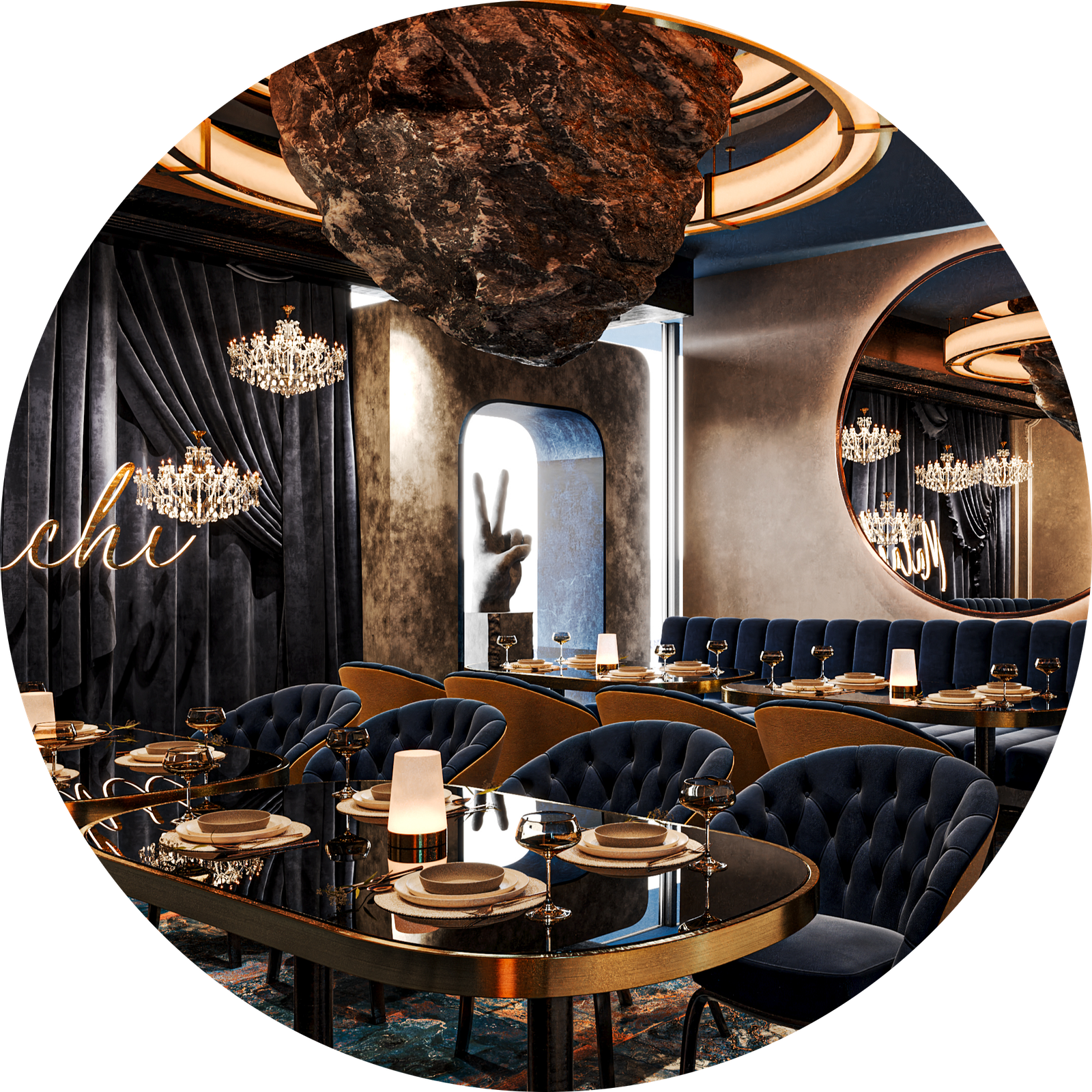
Real-Life Example
Let’s say you’re designing a living room:
- 60%: Soft gray walls, a large neutral rug, and a gray sectional sofa.
- 30%: Navy blue armchairs, curtains, and a media console.
- 10%: Mustard yellow throw pillows, a gold vase, and wall art with yellow accents.
Boom — your space feels polished and intentional, not like a mix of random colors.
Final Thoughts
The 60-30-10 rule isn’t just a design trick — it’s a foundation. It gives you structure without limiting creativity. Whether you’re starting from scratch or refreshing an old room, this simple color ratio can help you build a space that feels cohesive, stylish, and uniquely yours.
So next time you feel stuck with color choices, remember: 60-30-10. It just works.


