


Color Psychology in Restaurant Interior Design: How Colors Influence Appetite & Ambience
Have you ever walked into a restaurant and immediately felt hungry, relaxed, or even energized? That’s not just great food or service — it’s color psychology at work.
In restaurant interior design, color isn’t just a style choice — it’s a strategic tool. The right color palette can increase appetite, improve customer flow, and even influence how long people stay. Whether you’re designing a fast-food joint, a cozy café, or a fine dining establishment, understanding color psychology can elevate both the aesthetic and function of your space.
What Is Color Psychology?
Color psychology studies how colors influence human emotions, behaviors, and decision-making. In the context of a restaurant, this means:
- Affecting appetite and food perception
- Shaping mood and energy levels
- Influencing how long customers linger
- Impacting brand identity and recognition
How Different Colors Affect Restaurant Environments
Red – Stimulates Appetite and Energy
Red is one of the most commonly used colors in restaurants, especially in fast food. It stimulates:
- Hunger: Encourages eating by increasing heart rate and excitement
- Quick turnover: Great for busy spots where you want customers to eat and go
Orange – Warm, Welcoming, and Appetite-Boosting
Orange has a similar effect to red but feels friendlier and more approachable. It creates a sense of:
- Warmth
- Sociability
- Enthusiasm
Yellow – Bright, Cheerful, and Attention-Grabbing
Yellow exudes happiness and energy, and when used correctly, it can:
- Encourage conversation
- Stimulate mental activity and appetite
- Brighten up small or dark dining spaces
Green – Fresh, Natural, and Calming
Green is associated with health, freshness, and tranquility. It sends a subconscious message that the food is:
- Fresh
- Organic
- Sustainable
Blue – Suppresses Appetite, Promotes Calm
Blue is rarely used in restaurant design. Why? Because it’s believed to reduce appetite — there are few naturally blue foods, so it’s subconsciously unappetizing.
However, blue can:
- Create a calm, relaxed atmosphere
- Work well in coastal or upscale settings
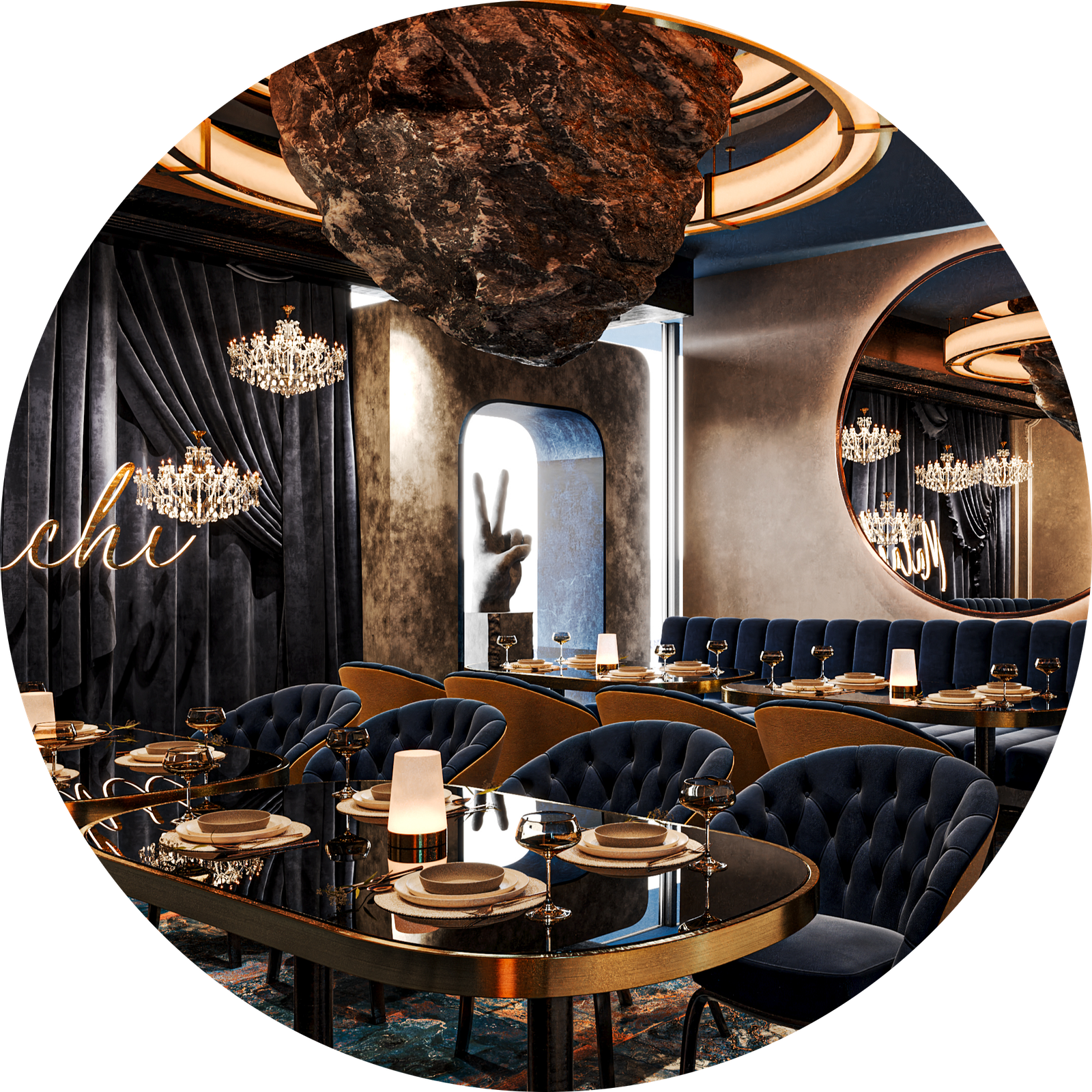
Purple – Luxurious and Artistic
Purple is not a natural appetite stimulator, but it adds sophistication and creativity. It’s ideal for:
- Thematic or high-end spaces
- Dessert lounges or wine bars
- Artistic, boutique restaurants
Black, White, Gray, Brown – The Neutrals
These are essential for balance and versatility in any restaurant color palette.
- Black: Sleek, modern, luxurious (best as an accent)
- White: Clean, minimal, brightens small spaces
- Gray: Modern and industrial; pairs well with bold colors
- Brown: Natural and comforting, often used in rustic or coffeehouse designs


